
Names and logos, especially their colours, are considered the holy grail of corporate communication. They are the face of companies, the legal entities. When a company is founded, it is virtually reborn. When children are born, they immediately have a face, are given a name and begin their lives with a first cry. This is not the case with companies. The “face” has to be formed, the name determined and the sound created. If you consider that up to ninety percent of all decisions are made through images and that video calls are increasingly replacing ordinary telephone calls because you can see the person you are talking to, it becomes clear how essential fitting logos and coherent naming are for the success of a company. In the course of my work, I often encounter the question or rather concern that existing companies are no longer recognised if they change their logo. The question of whether the logo has ever really fitted is not even asked. Fit can be measured – so can success, but lost potential can only be measured when the logo has been adapted to the target criteria and the corresponding changes have taken place.
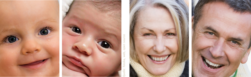
People: Facial features change throughout life. The older one gets, the more people’s faces differ due to their different living conditions and environmental influences (state of health, climate, nutrition).
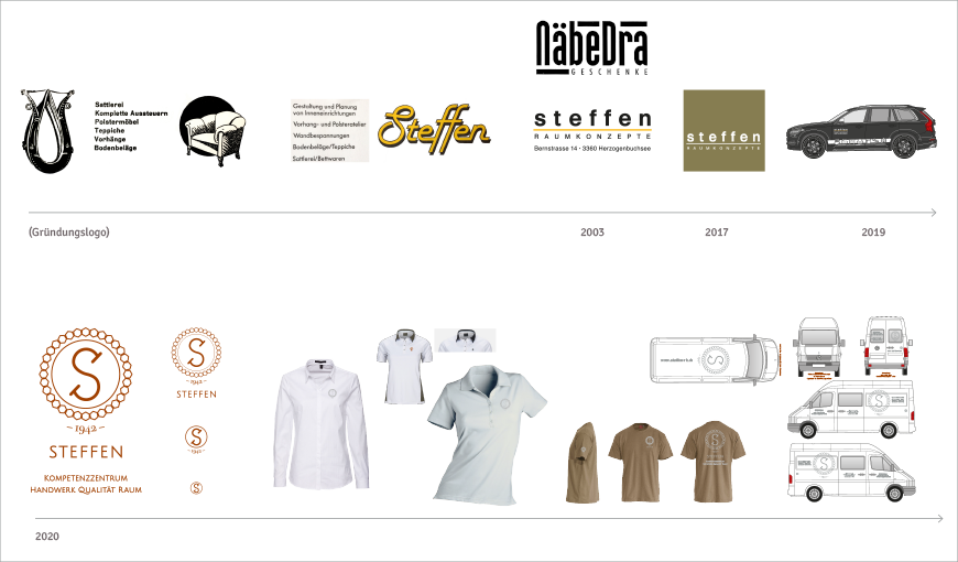
Latrace project: the longer companies use a logo, the harder it is for some entrepreneurs to decide to change. This is accompanied by a loss of fit, because time and space constantly change the context and thus constant adaptation would be necessary to communicate the constant inner qualities and company values in a fitting way.
Working approach 1 – design determined from the outside:
The logo is created or invented as part of a design process. An image is generated by means of graphic design. The less clarity there is about the specific characteristics, the more communication may be required to convey certain messages or trigger emotions in the viewer. It is remarkable that many companies dispense with the “face” altogether and merely give the company a name. An essential level of perception is missing and communication from within does not take place.
Working approach 2 – design determined from within:
The logo is created in a design-creating process in which the external appearance is largely determined by the inner essence of the thing and expresses its qualities and characteristics in the best possible way.
Example Latrace Project: Founding of the company “Raumson – Building and Living”
Motivation and feedback from Alexander Marx on the development of the corporate identity of Raumson LLC
“For the cooperation regarding the identity of my new company, I was convinced on the one hand by the very good cooperation with you/Latrace for several years now (e.g. projects such as Uitikon, Holziken and Herzogenbuchsee), where I was able to experience the “before and after effect” from start to finish. That was very groundbreaking, convincing and exciting. It is always very interesting to witness the changes. Secondly, I am convinced of the Archiveda® concept and consider it a completely new and as a unique approach on how you can create a very personalised concept for the client, which not only creates a sense of wellbeing in the room, but also spatial health, which is ultimately healthy for the body (and mind) of everyone who then uses these rooms…”
Concept
Raumson is about building and living. Alexander Marx, founder, owner and managing director of Raumson GmbH is a master plasterer and trained baker. During his entire apprenticeship and professional career, and as an experienced member of the management of a large Zurich plastering company, he has experienced more and more, especially in recent years, how closely building quality and quality of life are linked – and what their loss means for the health and well-being of people and spaces. This gave rise to the desire to be able to accompany and advise companies and private individuals even more intensively. The aim of Raumson is to impart more knowledge about alternatives to conventional building and to accompany building projects throughout the entire process of material planning to structural implementation, for example with natural and aroma plasters as well as with natural stuccos. This results in new approaches to optimise acoustics and indoor climate and to strengthen the well-being and health of people and spaces.
Name Raumson
Raumson is composed of the words “space” and “-son”. Space refers to the built space as well as the human body. “Son” stands for sun, probe and sound – from the Latin sonare (to sound). In analogy to the naming in Sweden, Raumson is the son of “Raum” (meaning space). Space is to be understood as the totality of space, as the environment. Raumson as the “child of nature” establishes the connection with people.
Logo image Raumson
The external appearance of Raumson was developed according to working approach 2 – design determined from within. The logo image shows a figure that combines the characteristics of a human being, a bird and other special features. The human-bird being consists of three parts: Kachina doll, bird and sun wreath.
Firstly,
the Kachina doll is the symbol for life bearers of the Hopi Indians. The Hopi are considered a primitive people. They live as one tribe on a reservation in the USA, mainly in housing structures made of stone and clay bricks. They are considered extremely wise and connected to the earth. The Hopi Indians serve to protect Mother Earth and respect life in harmony with nature. Their survival is severely threatened and their rights are severely restricted by the authorities.
Second:
The wings of the bird stand for freedom, freedom of movement and melodious resonance.
Third:
The wreath of the sun stands for the energy that humans need to live. All energy comes from the sun. We perceive its light as colours. Sensory perception is the connection between people and their environment. The more solar energy people get, the more energy they have to live. That is why materials that are as natural and close to the sun as possible are healthier than industrial products. However, doing without industrial accelerators and chemical substances also requires a different working process in construction. Therefore, probing the actual state is just as important as defining the target state of a space. This is the only way to optimally determine the energy regulation, climate and acoustics of a room. Since natural materials and the corresponding work processes have been greatly forgotten, Raumson is dedicated to sensitising people and companies to consciously integrate building and living into their decisions.
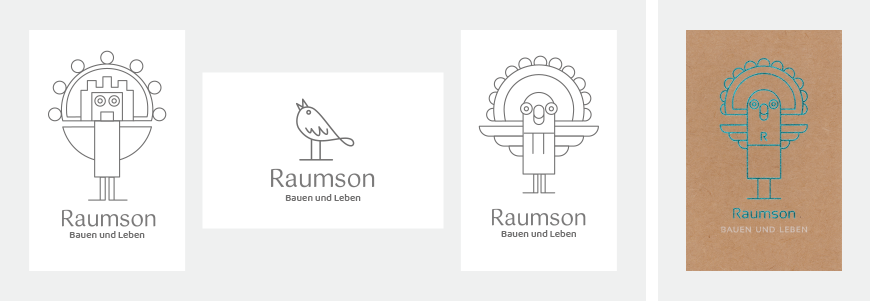
Logo image – creation process. Left panel: 1. simplified graphic representation of a Kachina bird puppet of the Hopi from North America. 2. bird with melodious singing voice. 3. integration of human features and bird wings. Right field: final result.