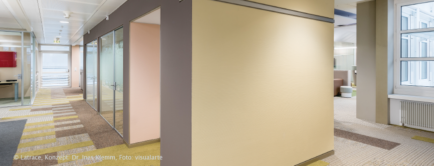
RAL colours inspire because colour information can be assigned consciously, specifically and according to objective criteria. The 1625 standardised colours of the RAL D8 Box have a precise “content specification” in the form of the seven-digit numerical code. This is precisely the basis for the content assignment of colours and user needs that Latrace is all about. Based on the inner properties and characteristics, the colour needs of people and the environment can literally be brought onto one wavelength with RAL D8 – scientifically founded.
During conferences and workshops for and with RAL as well as in many personal conversations over the past ten years, an appreciative and always exciting exchange has developed with Markus Frentrop. Thank you, dear Markus, for taking the time for this interview.
Since when have you been enthusiastic about colours and why?
The enthusiasm for colours has been present since my youth. I can still remember the cellar in my parents’ house, where there were many different pots and containers of paint on the shelves. I was fascinated by the fact that various surfaces on and around our house were so intensely enhanced by a new coat of paint.
What there a particular experience or other trigger for your interest in colours?
It was probably more of a gradual development that brought me to colours. As a youngster, technique tends to be in the foreground when dealing with colours. In the course of time, however, the view changes. The design becomes more important. A good choice of colours for the first own home has to be made and the interest in the subject of colour grows – it just won’t let you go ????.
From your point of view, has the expectation and perception of colour changed in the last ten years? If so, why and in what direction?
Fortunately, we at RAL Colours have noticed that the topic of colour and colour design has received more and more attention in recent years. This is certainly related to an increased media presence of colours, but also to more comprehensive, scientifically based findings. At the same time, there is an increasing awareness that the competent use of colour has a noticeably positive influence on people’s well-being. Especially in our busy, hectic times, it is important to come to rest and feel good, especially within one’s own four walls.
What is your expectation of a good colour consultation?
A good colour consultation should always focus on people and their needs. From my point of view, the high art of the consultation consists especially in finding out what the customer actually wants and needs. In our experience, the latter does not necessarily always coincide with the trends and developments that are often suggested by the multitude of relevant magazines. The final room concept, i.e. a harmonious interplay of colour concept, materials used and interior, is decisive for assessing the quality of advice. Only the coordinated interaction of these components ultimately leads to a positive feeling of space.
How would you describe the task and vision of RAL Colours in a nutshell?
RAL Colours sees its task in supporting professional colour design in its work and in sustainably increasing the feel-good factor for people in the shaping of their living and working environments. Ultimately, all activities of RAL Colours serve the purpose of making people feel better and safer in an actively colour-designed environment.
What would you like to see in order to make people even more aware of the importance of colour and the work of RAL Colours?
In general, I would like to see even more appreciation for good colour design and the topic of colour as a whole. Too much is still trivialised and talked down in this area. As far as RAL Colours is concerned, we would be happy if we were perceived more intensively as a modern supplier of colour design products. We always experience the wonderful moment of surprise when our customers discover the versatile and broad spectrum of design elements RAL offers for sustainable work with colour.
What is colour for you personally: an emotion, a state or the visual perception of surfaces?
Definitely emotion. Colour does much more than just appeal to our eyes, it speaks to us on various sensory levels. If we compare our own emotions when looking at a calm, blue surface with those when looking at a multi-coloured, intense surface, it very quickly becomes clear that colour reaches us on completely different levels.
What do you love about and in your home country?
First of all, I like the people, of course. Especially because I travel a lot, my family and my home are the perfect favourite places for me. What I like most about my home is the variety between the hustle and bustle of city life and the immediate proximity to the Siebengebirge. Together with my wife, I’m out and about a lot and enjoy the greenery of the forests, and I’m always thrilled by the view of the Rhine from above. And at the end of the day, a visit to the Italian restaurant around the corner is always worthwhile.
https://latrace.ch/files/3B_La_20170529_Interface.pdf
https://latrace.ch/files/1B_I_2014_RAL_Schulbau_Magazin.pdf


